

How to Style Impressionistic Nature Art at Home
Table of Contents
- Start With the Room: What to Decide Before You Hang Anything
- Best Wall Colors for Landscape Art (and Why Neutrals Usually Win)
- How to Arrange Gallery Walls With Nature Art Without Visual Clutter
- Lighting Tips for Wall Art: Reduce Glare, Reveal Texture
- Framing and Finishing Impressionistic Nature Art
- Digital vs. Physical Styling: Preview Before You Commit
- How to Style Impressionistic Nature Art in Small Apartments and Rented Spaces
- Conclusion
- Frequently Asked Questions
Last Updated: September 25, 2026
Start With the Room: What to Decide Before You Hang Anything
Most people hang art last, after the sofa and rug are in place. That's backwards, and it's why so many walls feel crowded or empty. Styling impressionistic nature art starts with one decision: what should this wall do for the room?
The fix: decide the wall's job before you buy.
Ask yourself three questions:
- Is this wall a focal point or a backdrop?
- Will people see it up close or across the room?
- Does the room need calm, or does it need energy?
Measure the wall and pick a focal point
Before you shop, measure the wall's width and height in feet. Then mark where your eye lands when you walk in, that's your focal point.
Match scale to wall size, not to the sofa
A common mistake is sizing art to furniture instead of the wall. A wide canvas over a narrow console looks stranded. Aim for art covering roughly two-thirds to three-quarters of the wall width above your main furniture piece.
Best Wall Colors for Landscape Art (and Why Neutrals Usually Win)
The best wall colors for landscape art are warm whites, greiges, and soft greens. These neutrals let the painting's palette do the talking instead of fighting it. The longer answer is about value and temperature, what separates a wall that flatters the art from one that flattens it.

Read the painting's undertone before you pick a paint chip
Every landscape has a dominant temperature. A misty marsh leans cool (blue-grays, silver-greens, soft violets); a late-summer field leans warm (ochre, burnt sienna, olive). Match the wall to that temperature and the art feels native; fight it and the painting looks pasted on.
- Cool-dominant art (water, fog, winter, dawn) pairs with cool whites and blue-grays. Warm walls make cool paintings look sickly.
- Warm-dominant art (fields, autumn, sunset, terracotta earth) pairs with warm whites, creams, and greiges. Cool walls make warm paintings look muddy.
- Balanced art (most green-heavy landscapes) is the easiest. Almost any neutral works, which is why soft greens and greiges are the safe default.
Named color families that reliably work
You don't need a specific brand, but these color families are the ones most practitioners reach for:
- Warm white: ivory, alabaster, and cream. Adds light without feeling cold or clinical.
- Greige: the gray-beige middle ground. Flatters both warm and cool art because it doesn't commit to either.
- Soft green: sage, eucalyptus, and muted olive. Echoes foliage and makes landscape pieces feel like they belong to the room rather than sitting on top of it.
- Warm gray: a gray with a brown or green undertone, not a blue one. Blue-undertone grays are the single most common mistake with green-heavy art.
The accent-wall move, done right
If you want more depth, paint just the wall behind the art a shade or two darker than the surrounding walls. Keep the other walls light. This creates a subtle frame and makes the canvas pop without a loud color. The rule of thumb: stay within the same color family, just go darker.
Coordinating the palette with your furniture style
This is where most styling guides stop, and it's what actually makes a room look designed. The wall is only half the equation; furniture and textiles set the palette the painting lives inside.
- Minimalist rooms (white walls, low-profile furniture, few objects) can handle a bolder, more saturated impressionist piece. The art becomes the only color in the room, so it carries the whole space. Keep the wall neutral and let the canvas be the event.
- Eclectic rooms (mixed patterns, layered textiles, warm woods) need the art to echo at least one existing color. Pull one hue out of the painting, a rust or a sage, and repeat it in a throw pillow, a rug, or a ceramic. That repetition is what makes an eclectic room feel curated instead of cluttered.
- Traditional rooms (rich woods, symmetrical layout, heavier fabrics) do best with warm-dominant landscapes and a wide, substantial frame. Cool, airy paintings can look thin against heavy furniture.
How to Arrange Gallery Walls With Nature Art Without Visual Clutter
The trick to a clean gallery wall is restraint: pick a clear anchor piece, then build outward. Clutter comes from too many pieces competing at the same size. Here's the concrete version.
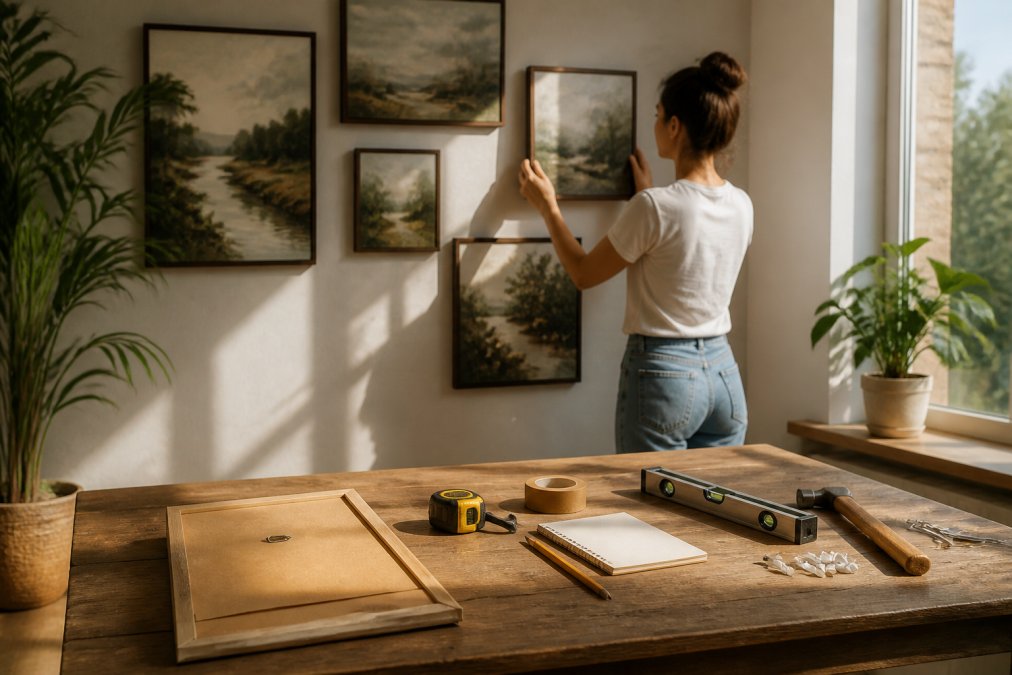
Start with the anchor and the math
Start with your largest canvas as the anchor, placed slightly off-center at eye level, 57 to 60 inches from floor to the center of the piece. Measure to the center, not the top of the frame.
A few rules that keep it calm:
- Keep all frames the same color
- Repeat one shape (all rectangles, or all squares)
- Leave breathing room at the edges
- Don't fill the whole wall
Four layout patterns that work with impressionist art
Impressionist pieces come in a few standard proportions, so layout matters as much as the pieces. These four patterns cover almost every situation:
Terracotta Echoes - Unique Frameless →
- The grid: equal-size pieces in even rows and columns. Cleanest and most modern. Best when your pieces are the same size and orientation.
- The salon (symmetrical): one large anchor in the center with smaller pieces balanced evenly around it. Traditional and formal. Works well with a wide horizontal landscape as the anchor.
- The staircase (diagonal): pieces arranged along an invisible diagonal line, usually rising left to right. Adds energy without chaos. Good for a hallway or a wall beside a staircase.
- The organic cluster: mixed sizes arranged around a single anchor with no strict grid. This is the pattern that suits impressionist art best, because the loose brushwork and varied canvas sizes feel intentional rather than regimented.
The 70/30 mix of large and small pieces
A simple ratio keeps a gallery wall balanced: about 70% large pieces and 30% small. The large pieces carry the composition; the small ones add rhythm.
Mixing frames and canvases without a mess
Impressionistic nature art often arrives as frameless canvas, a gift for gallery walls because canvas has no frame edge to fight with. If you mix framed and unframed pieces, keep the frame color consistent across the wall even if widths differ. A thin black frame beside a thin wood frame beside a frameless canvas looks collected; black next to gold next to white looks like a yard sale.
Lay it out on the floor first
Before putting a single hole in the wall, lay the arrangement out on the floor. Trace the outer boundary with painter's tape, place the pieces inside it, and stand back. It's the cheapest way to catch a layout that's too tight, too sparse, or off-balance. When it looks right, transfer the tape outline to the wall and hang to the tape, not your eye.
Lighting Tips for Wall Art: Reduce Glare, Reveal Texture
Good lighting cuts glare and reveals texture. Impressionist brushwork and canvas grain only show up when light hits the surface at an angle.
Framing and Finishing Impressionistic Nature Art
Framing changes how a piece reads. A thin frame feels modern and lets the image breathe. A wide, ornate frame feels traditional and adds weight.
A few finishing choices:
- Frameless canvas: clean, modern, and light on the wall
- Thin wood frame: warm and natural, pairs well with earth tones
- Floater frame: adds a small gap so the canvas appears to float
Digital vs. Physical Styling: Preview Before You Commit
Physical styling still wins for texture. You can't feel impasto or see how light catches a matte canvas on a screen. If texture is the point, buy the physical piece.
How to Style Impressionistic Nature Art in Small Apartments and Rented Spaces
Renters and small-space dwellers have real limits: no holes in the wall, no room for big pieces. Impressionistic nature art is easy to adapt.
- Use removable adhesive strips instead of nails
- Choose a medium canvas that fits a single wall
- Lean larger pieces on a shelf or console instead of hanging
- Group two or three small prints for impact without a big footprint
Conclusion
Styling impressionistic nature art isn't about buying more. It's about choosing the right piece, the right wall, and the right light.
Frequently Asked Questions
What wall colors best complement impressionistic nature paintings?
Warm whites, greiges, and soft greens tend to work best because they let the pigment and loose brushwork carry the room. A very saturated wall competes with the tones in the piece and can make the whole wall feel busy. If you want contrast, try a deeper neutral like charcoal or forest green on one accent wall behind the art, and keep the surrounding walls light so the impressionistic nature art stays the focal point.
How do I choose the right frame for impressionistic landscape art?
Thin, simple frames keep attention on the painting instead of the border. A light wood or soft neutral frame suits airy water scenes and pale skies, while a darker frame adds visual weight to moody forest or earth-tone pieces. Frameless canvas options also work well because they let the texture and paint surface read as one continuous object, which suits a modern or minimalist room.
What is the best lighting for displaying impressionistic wall art?
Aim for even, diffused light rather than a single harsh beam. Position ceiling or track lights so they wash the surface at a shallow angle, which reveals canvas texture and brushstrokes without hot spots. Avoid placing art directly across from a bright window, since glare flattens color. If you use a picture light, choose a warm bulb around 2700K to 3000K so the palette stays true.
Can I mix impressionistic nature art with modern furniture?
Yes, and the contrast often works in your favor. Keep the furniture lines clean and the palette neutral, then let the art supply the color and movement. In a minimalist apartment, one large impressionistic nature art piece reads as a deliberate focal point rather than clutter. If you group several pieces, align them to a single horizontal or vertical line so the arrangement feels intentional next to straight-edged modern furniture.